





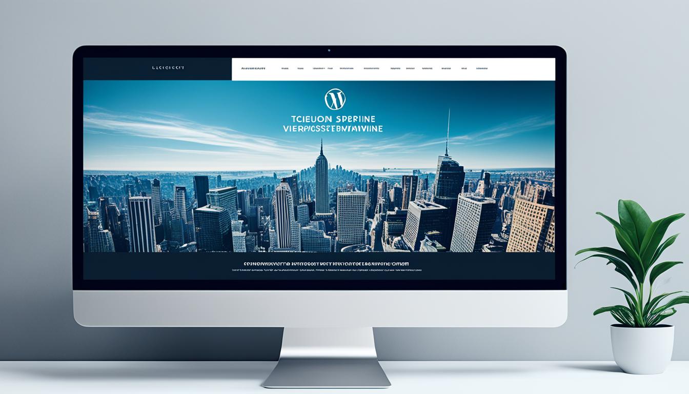
A Photoshop document can show how a page should look at one screen size. It cannot define how a menu opens, what a form does, how a post archive works, or how the layout changes on a phone. Those choices belong in the project brief. A good conversion turns them into a site that editors can use without reopening Photoshop for every change.
Choose a build route before requesting a quote
| Route | Useful when | Check before choosing |
|---|---|---|
| Adapt an existing block theme | The design can fit an established theme’s templates and styles. | Which parts are editable in the Site Editor, and what custom work remains? |
| Build a custom block theme | The design needs reusable blocks, patterns, and full-site editing tailored to the project. | Who maintains the theme and its templates after launch? |
| Build or extend a classic theme | The existing site or required integration depends on PHP templates and established classic-theme code. | How will future WordPress changes and the editor experience be handled? |
WordPress documents both block and classic themes. Block themes use HTML templates and the Site Editor; classic themes use PHP templates. Its template hierarchy determines which file displays a post, page, archive, or other view. A developer should explain the route chosen for your site rather than treating every design file as the same job.
Prepare the material a developer needs
- Design source and assets: Provide the PSD and any fonts, icons, photographs, logos, and rights information. Ask which images need separate export; modern responsive design rarely involves cutting the whole page into image slices.
- Layouts: Include desktop and mobile views for the homepage and each distinct template. Mark what changes at smaller widths.
- Content model: List the page types, post types, fields, navigation menus, and reusable sections. Identify text and images editors must be able to change.
- Behavior: Specify form destinations, search, filters, menus, pop-ups, and any ecommerce or account functions. A static design does not settle these behaviors.
- Existing site: If this is a redesign, supply an inventory of current URLs and functions that must survive. Note integrations and analytics that need testing.
Where the design is silent, ask for a decision before development. For example, a three-column desktop card grid may become one column on a phone, or it may need a different order. That affects reading order and editing, not just appearance.
What the build should contain
The developer creates templates for the views in scope, shared styles, and the controls editors need to update content. Site-critical behavior such as forms or a product system should be documented separately from presentation. WordPress’s theme handbook advises keeping critical functionality in plugins so it does not disappear when the theme changes.
Ask for a staging site and review representative content, including a long title, a page with several images, an empty state, and a form. WordPress’s theme-testing guidance recommends testing varied content, screen sizes, and browsers. A beautiful homepage screenshot says little about whether the archive, mobile menu, search, and editor work.
Acceptance checks before launch
- Content: Can an editor change the text, images, menus, and repeated sections without touching code? Are headings in a sensible order?
- Responsive layout: Check common phone and desktop widths, long words, zoom, and both portrait and landscape views where relevant.
- Interaction: Use the keyboard to open menus and forms. Check labels, focus, error messages, and confirmations.
- Performance: Measure representative pages after the real images, fonts, plugins, and scripts are installed. Do not infer speed from a blank theme demo.
- Search continuity: Preserve important URLs or plan redirects. Inspect titles, descriptions, internal links, image alt text, and crawl access. A theme does not guarantee rankings.
- Handoff: Obtain access, source files, documentation for custom blocks or fields, licenses, backup and update instructions, and a record of what remains outside scope.
For a redesign, compare the staging site with the current site page by page before switching. Keep a rollback plan. The output you are buying is a maintainable WordPress site with the agreed behavior, not a mechanical conversion of one Photoshop canvas into HTML.
Frequently asked questions
Can a PSD file be converted directly into a WordPress theme?
No automatic conversion creates a finished site. A developer uses the design as a specification, then builds responsive templates, styles, editable content, and any required behavior in WordPress.
Do I need to slice the PSD into images?
Export actual assets such as photos, logos, and icons, but do not turn the entire page into image slices. Layout, text, and interactive elements should be built as responsive HTML and CSS or WordPress blocks.
Should I use a block theme or a classic theme for a PSD conversion?
An existing block theme can work when the design fits its templates; a custom block theme gives more tailored editing; a classic theme may suit an established PHP-based site. Choose based on the existing site, editing needs, integrations, and maintenance plan.
What should I give a PSD-to-WordPress developer?
Provide the design source, rights-cleared assets, mobile layouts, content types, required interactions, current-site URLs if this is a redesign, and a list of what editors must be able to change.
Will converting a PSD design to WordPress improve SEO?
The conversion alone does not establish a ranking benefit. Check crawl access, titles, links, content, image descriptions, mobile usability, page performance, and redirects on the finished site.

Data analytics expert. As an analyst and project manager, I have proven to be a strong leader and team player in maintaining a suitable workspace for workers and industries in the oil and gas sector.
By taking into account various factors, with the assistance of state of the art technologies and the utilization of Big Data Analytics.
This includes considering various aspects like volume, velocity, variety, veracity, value together with complexity.
With the recent advent of data recording sensors in exploration, drilling, and production operations, oil and gas industry has become a massive data intensive industry.

