A landing page is a page within your website that you refer to from other media. Think of a link from an AdWords campaign. A landing page provides more conversion. But why is that? And what requirements must a landing page meet?
Related posts:
You can, of course, also send visitors to your homepage or a product page. Still, if your landing page seamlessly matches your advertisement, the visitor will have to make less ‘effort’ to orientate himself.

The landing page is, in fact, a transition page that you place between the advertisement. Communication gets visitors to your website and prepares them for the products and services you want to show.
Sometimes a landing page cannot be found in a menu because it is specially made to ‘receive’ visitors who have clicked on an ad. You don’t make a landing page to make it easier to find. It is better to use (blog) articles to place links to a landing page.
The advantages of a landing page are:
- Because your landing page will match your advertisement, your visitor does not have to think or search. This will result in fewer visitors who drop out and more visitors who read the landing page’s message.
- An additional advantage is that Adwords looks at the relevance of your landing page and your Adwords ad. The closer they are, the better you will be assessed and pay less for a ‘click.’ In other words, a solid landing page will save you a lot of advertising costs.
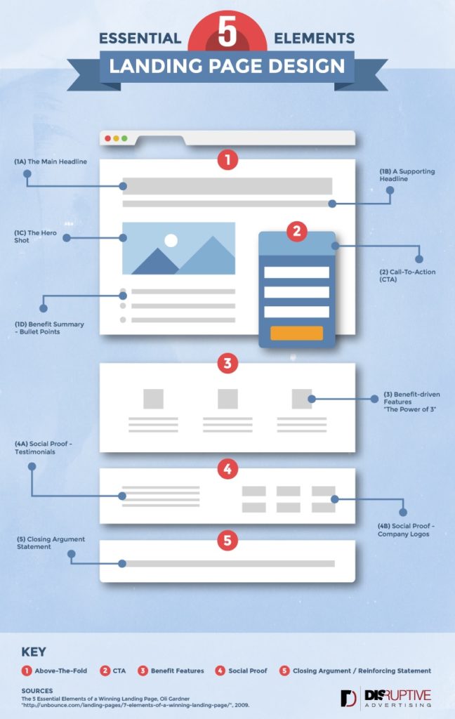
- You can persuade and convince the visitor step by step. In your ad, you lure the visitor with an advantage. On your landing page, you can mention even more benefits and confirmations with ‘social proof.’ Think of all the reviews, quotes, and references. Always remember to provide a name and photo; otherwise, the “proof” has no value.
- All these elements together ensure that the conversion goes up.
4 Tips for a Successful Landing Page
- Make sure the message matches your advertisement. A very eye-catching landing page title may seem funny, but your goal is not to attract attention. If all goes well, the ad will already do that for you. It is now about trust and conviction!
- Convince with benefits for the visitors. No list of specifications focuses on concrete benefits.
- Keep it clear and ensure as little noise as possible. All elements that do not directly act as a link between advertisement and offer can be removed.
- It is important to keep it simple for the visitor. One goal, one call to action.
- By that, I do not mean one button. You can display many buttons, as long as there is only one goal. And the best goal is a page where you go a little bit more into what you have to offer. More background info, specs, references, reviews, and examples.
- A solution to the ‘noise problem’ above is that you divide the benefits, social proof, and information into different pages. You link those pages together in a way that the visitor is convinced step by step. This is also called a funnel. You can read more about funnels in this article: The best content is made with a funnel.
An example

This is a Campaign Monitor landing page. A well-known e-marketing system was targeting the slightly more serious marketer interested in optimizing the e-marketing campaign. What are they doing well, and what could be improved?
Measure success
The success of your landing page can be measured very well within Google Analytics. The basic question here is: “How many people go to the landing page and how many people go to the product/service page?” The greater the number of people who click through, the better, and you can adjust your content to see if you can influence this number.
Sometimes very small differences, such as the text of your call to action button, can make a lot of difference. Once you have created landing pages, it pays to A / B test them and optimize your landing page. See also: Your first A / B test within 5 minutes.
With an A / B test, you make different variations of your landing page, and you can test whether “Start today” does better as a call to action than “Request a trial period.”
Do you have questions about landing pages? I am happy to read and answer them below in the comment section.
Data analytics expert. As an analyst and project manager, I have proven to be a strong leader and team player in maintaining a suitable workspace for workers and industries in the oil and gas sector.
By taking into account various factors, with the assistance of state of the art technologies and the utilization of Big Data Analytics.
This includes considering various aspects like volume, velocity, variety, veracity, value together with complexity.
With the recent advent of data recording sensors in exploration, drilling, and production operations, oil and gas industry has become a massive data intensive industry.


