You may be familiar with the fact that colors can have a psychological effect on people. Colors induce certain emotions and communicate with a part of our brain (the hypothalamus), which ensures that hormones are released that influence your mood, emotions, and behavior.
Colors are important for conversions
Research shows that color has a massive influence on purchasing decisions. Some marketers believe that the color of a product is 85% the reason why you buy a particular product. Besides, color plays a vital role in call-to-action click-through ratios.
It, therefore, seemed sensible to us to give ourselves the challenge to connect the world of color psychology and that of CTA colors in the form of the following question:
“Which background colors combined with which CTA colors provide the highest conversion rate?”
First of all a small disclaimer on the above question. There is never ‘1 single magic pill’ or a single route to success in online marketing. It will differ per branch, niche, even per entrepreneur or company, which is the optimal combination. However, it is possible to start from a number of basic best practices that ensure that you have an advantage over the competition. The aim of this article is, therefore, to give you access to these fundamental insights and to be able to continue working towards an ideal color / CTA combination for your business.
Color best practices to increase conversions
To get an answer to our main question, we first have to zoom in on the focus of the target group.
What type of customer do you have to deal with? Therefore, always work out your focus target group in the form of a persona. This is your starting point for designing copy, sales pages, CTAs and therefore color use and color contrast. Do you have a good picture of your focus target group? Then ask yourself the following questions:
1. Is your customer B2B or B2C?
Business to business (B2B) and Business to consumer (B2C) are two different customer types that you want to approach differently. In the field of color use, this difference is expressed, for example, in:
The mind frame of the potential customer
A B2B customer looks for solutions to business problems. A B2C customer looks for answers to personal problems. This difference in motivation ensures that a B2B customer is more inclined to opt for providers who:
– look like your own organization
– is highly regarded/radiates quality
– has a proposition that specifically addresses the problem that needs to be resolved.
The B2C customer, on the other hand, does not represent an organization, but himself and his own money. A B2C customer is, therefore, more inclined to opt for providers who:
- offer a good price-quality ratio
- has a concrete offer that removes the problem that needs to be resolved
- have an appearance that is reliable
The difference in mind frame explains why many B2B providers often seek refuge in colors that radiate reliability (blue), while at B2C providers we often see a much brighter palette of colors, depending on the nature of their products or services.
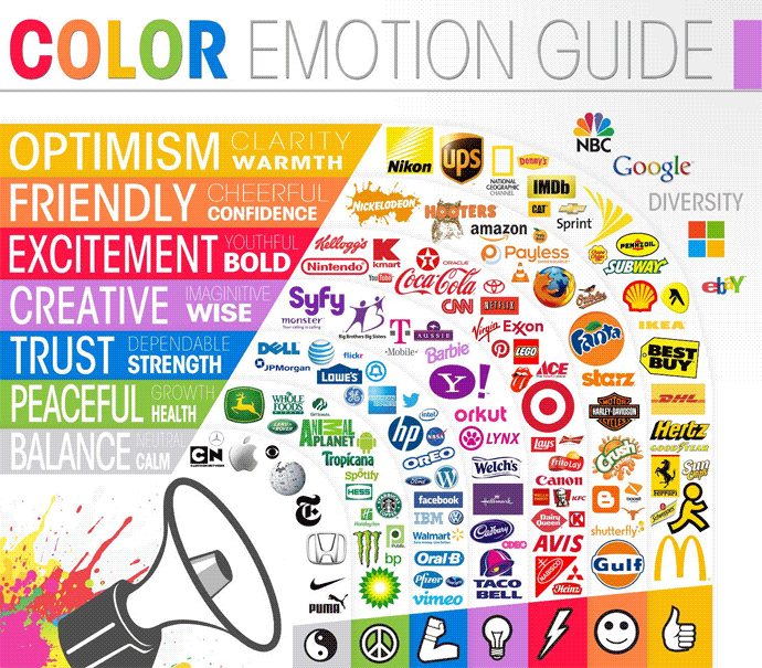
Below you can see a table with the different colors and their associated psychological charge:

And, also in the text just in case the picture falls away or does not load fast enough: color
Psychological meaning
- Yellow – Optimistic, warm, clear
- Orange – Kind, cheerful, confident
- Red – Excitement, youthful, brutal
- Violet – Creative, imaginative, wise
- Blue – Reliable, trust, strength
- Green – Peace, health, growth
- Silver – Balance, calm, neutral
2. Is your customer young or old?
A general color palette is usually used for elements such as a logo, house style and general look and feel of a website. You can see this as the general frame surrounding the content of web pages. The content itself (product pages, service pages, landing pages, etc) you then want to focus more closely on the focus target group (s) you serve. It is precisely at the content level that you can make the biggest difference in terms of conversions.
An important consideration that you can take into account is whether the focus of the target group is mainly young or old. However, be aware that the choices you make in this are never cast in stone: the way older target groups now deal with online media that will have changed in 10 years. However, the fact that older users feel more comfortable with something that is familiar or friendly, remains reliable or gives peace and health (blue, green, orange). Younger target groups are more attracted to excitement, fantasy, and creativity (red, purple, orange).
3. Is it a man or a woman?
Finally, women feel attracted to different colors than men.
Women especially like:
Blue
Violet
Green
Men especially like:
Blue
Green
Black
Women do not like:
Orange
Brown
Gray
Men do not like:
Brown
Orange
Violet
Source: https://blog.kissmetrics.com/how-colors-affect-conversions/
The different preferences in terms of colors can be seen a lot, for example, the color of products and clothing. Women feel less attracted to ‘earthly’ shades and men go more for the male shades of blue, green and black. Note that these preferences may affect the background colors and design elements that are used in a website. For example, the color orange is a very strong color element to be used as a playful element in web design because this color stands out in a cheerful way. Although the color orange is not considered among the favorite colors for both men and women, it can be a powerful contrast color to increase conversions.
Putting it together
Which optimized combinations of background colors and CTA colors can we think of if we take the above considerations into account? In general, the most important rule of thumb is that a CTA should jump out of the design. Some tests show that the best results are obtained with CTA buttons in the colors Orange, Green and Red. However, you see nowadays that there is more and more chosen for a background color that fits well with the focus target group and identity of a provider in combination with a white CTA button that jumps through the contrast from the design.
Data analytics expert. As an analyst and project manager, I have proven to be a strong leader and team player in maintaining a suitable workspace for workers and industries in the oil and gas sector.
By taking into account various factors, with the assistance of state of the art technologies and the utilization of Big Data Analytics.
This includes considering various aspects like volume, velocity, variety, veracity, value together with complexity.
With the recent advent of data recording sensors in exploration, drilling, and production operations, oil and gas industry has become a massive data intensive industry.


